2009-08-19

It's all about the lenses!


I stumbled across a post on Craigslist. "High End Professional Photography Studio Sale (August 22&23) (1300 N. Wilton Pl., Los Angeles 90028)" I looked at the pictures in that post, and it brought back a lot of memories. All of the pictures here are from that Craigslist post.


Back to my story. The year was 1990. I was shopping for photographic equipments. I was armed with The Recycler (a print version of today's Craigslist/eBay-local). The rationale for shopping heavy duty photographic equipments was that they're good investments-- they would last a life time. After all, the basic photographic techniques had been the same since the early 1900s. You take a picture, develop on a canister, darkroom darkroom darkroom, print, done. It was done that way in 1900, in 1910, in 1920, 1930, 1940, 1950, 1960, 1970, 1980, and 1990 (black and white still done that way at the time). Why wouldn't it be any different in 2010, 2020, 2030? So I thought at the time.


I had an early version 1978 Pentax K1000 with a 55mm f/2 lens, and it was all I needed. The only other things I needed were darkroom equipments, and some black and white filters. I responded to a post on the Recycler. I showed up at this house in Granada Hills. This old man with white hair opened up the door. He said "oh, so you're Kevin?" He sounded a bit surprised, and I could hear the tone "Oh great, it's just a kid." He was a retired photographer selling off a bunch of old equipments, from drums, to easels, to enlarger, trays, chem bottles, camera lenses, everything. He turned out to be a nice and patient guy and explained some of the equipments that I didn't know how to use at the time. I ended up spending 4 hours looking at his arsenal of professional photo equipments. I came out with more photographic knowledge than before, more equipments, and an almost empty wallet. But I was ready to create my own photo lab, and I was excited!!! Many kids at the time just wanted to spend hundreds of dollars perfecting their Street Fighter techniques and such. I had my own darkroom... waaay cool, dude.

Even as digital photography became more prevalent in the late 90s, many professionals laughed at it. The resolution sucked. The color sucked. Everything sucked about it. Some experts estimated that it took 100 years for photography to reach the state of the art quality, and it would take at least a few more decades to do the same, digitally. But Moore's Law proved everyone to be wrong... doubling transistors every 18 months, and doubling computational power every 2 years or so... you continue this trend, and in 10 years, digital photography surpassed everyone's expectations. In less than 10 years, most of the pro photographers were already on digital (digital processing and digital capture).

When I finally parted with my darkroom equipments in 2008, I barely got back any money, after taking in consideration of shipping costs. You see these pictures of the old film equipments? They're no different than what I saw in 1990. The difference is utility-- they were useful in the 1990, and today, they're obsolete and worth very little. Hardly anyone wants to use an enlarger, let alone dealing with stinky chemicals and trays. Digital processing is not just "good enough", it is superior. With one mouse slider in Lightroom/Picasa/Photoshop, you can change contrast in 1 second. You can change the tone in 1 second. You can change the exposure in one second. You can burn and dodge in 10 seconds. A single print that may have taken masters like Ansel Adams hours to create, now takes minutes. In some instances, you can create amazing results in your digital darkroom, in seconds.


See the pictures on this post? Almost everything is worth... $0.00. They have little utility in today's world. The only things that are still worth something... are the lenses. Optics don't change like electronics. No matter what technology you're using, you need to capture light. Optical innovations isn't subject to Moore's Law. You see that old Nikkor AI 50mm f/1.4 above? It's still worth a lot. A good lens in the 70s, is still a good lens today.

It's all about the lenses!

Canon finally reversing their high megapixel trend


Today, Canon announced the Canon G11, a large sized point-and-shoot camera. The intended audience for the G-- series cameras include professionals and serious enthusiasts who use it in conjunction with their big SLR bodies. It is only 10MP. Interesting, the older Canon G10 had a whopping 14MP. It appears that Canon reversed the high-megapixel trend. What happened?

Well, remember the old post I made "High megapixel cameras preferred by lousy photographers"? For the past 3 years or so, Canon has making higher and higher megapixel cameras, esp. on small sensored point-and-shoot cameras. They have been doing so, because the laymen thinks that the higher the megapixel, the better it is. To Canon, the higher megapixels the cameras, the better they sell, so they kept going higher and higher. It is no different than a car maker enticing teenager drivers with meaningless specs like horsepower and torque. In the old days, the higher the horsepower and torque a car had, the better they sold. But then people got smarter, and realized that there was so much more that makes a car than horsepower/torque... things like comfort, mileage, ergonomics, reliability, cost of ownership, insurance rate, etc. As the car manufacturers mature, they started reversing the big horsepower trend.

IMHO, today is the day we can mark that the digital camera market is maturing. The fact that Canon reversed its high-megapixel trend, is a sign that digital camera shoppers are finally getting smarter, and more matured. They are now realizing that higher megapixel doesn't equate to a better camera. Let's take a quick look at images from the old G10. At the lowest ISO of 80, the images from the old Canon G10 (with a whopping 14MP) looks spectacular. But at the higher spectrum (1600-3200), it is completely unusable. It is grainy. It is artificial. It is ugly. As mentioned in my old blog previously, the trade-off for having high megapixel is 1) higher noise at higher ISO and 2) unusable pictures at less than ideal lighting situation. Granted, if the purpose of a camera is to use it during an ideal bright day or in a studio, a high megapixel is perfect for the job. But most people shoot in all conditions, day and night, indoors and outdoors, and most of the time in less than ideal lighting situation.

Let's take a look at a picture from a G10 (Courtesy of http://www.imaging-resource.com/):

100% crop shot at 100 ISO. It's got great tones, colors, and details:

100% crop shot at 1600 ISO. Look at the massive amount of in-camera noise reduction applied to the picture. It's very digital/artificial. It's ugly! We don't need to look at 3200 ISO even though the G10 can go up to 3200 ISO. That high ISO is marketing BS from Canon.


Not many people have had a chance to play with a G11 or look at sample pictures online, but the fact is clear-- Canon is reversing this high-megapixel non-sense. Personally, I think this is an indication that 1) the laymen are slowly recognizing that higher megapixel doesn't equate to better pictures 2) Canon is responding to the market demand, and making a camera that is more capable in less than ideal situations (vs. a high megapixel camera that sells well). In the past few years, numerous posts on photography forums indicate that people are now realizing that high megapixels means trading off resolution for image quality. Kudos to Canon for making a lower megapixel camera that shoots well, and kudos to all the buyers out there resisting buying a camera with high megapixels.

The digital camera market is maturing.

2009-08-08

Model shoot - Jane Chiu

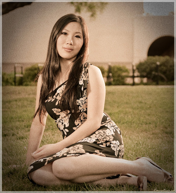
Jane Chiu is a former co-worker / model / friend who needs a few shots for her upcoming pageant. The location of this shoot is at Caltech. She's experienced so it's easy to shoot her, with minimal instructions and setup time.

At the time I had the luck of having FIVE assistants-- my beautiful wife Pam, her brother Ben, brother's wife Karla, her mom Yuen, and Jane's bf Rob. I designated Pam as the main light, Ben as the fill light, and Karla as the hair light-- the rest carried equipments. We had about an hour and a half to shoot (6:10 till sunset), so it was a very fast paced session. I like fast paced shooting sessions.

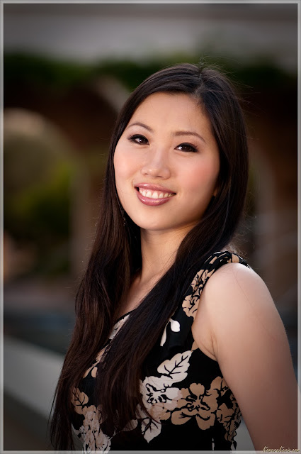
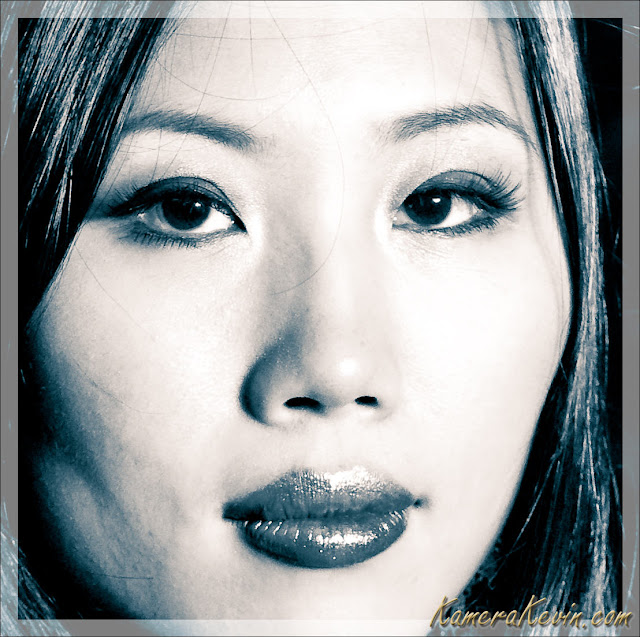
I prefer to shoot a client's head first-- the make up is still fresh, there isn't a lot of sweat, and the eyes and expressions are still sharp (model fatique kicks in after an hour or so). Therefore, I almost always start with head shots first. Below is a 3rd try. I kept this one because the face is clear, the lighting is soft (thanks Pam!) and the catch light in her eyes shows up clearly. Also I liked the blurred domes/arch that I placed in the back. Nikkor 105mm f/2.8G VR.


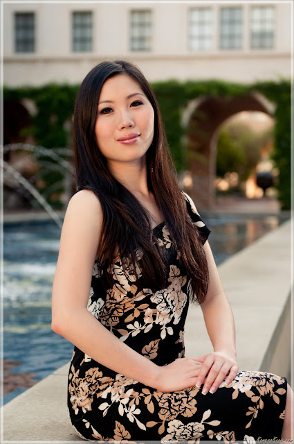
After a few usable head shots, I move to half body shots. The sun-ray hitting to the side of her hair and a little bit of the face-- flash magic. Nikkor 24-70mm f/2.8G.


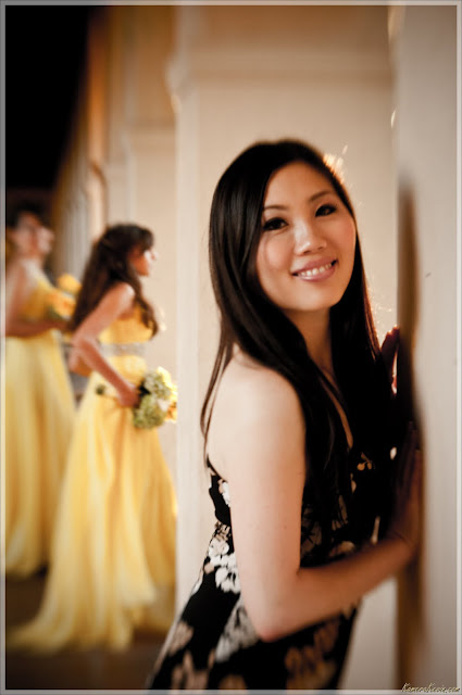
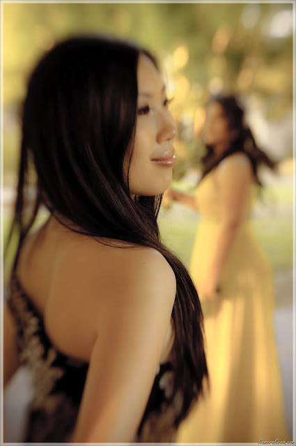
After about 1/2 hour we moved to the hallway in Caltech. There were a bunch of people dressed up for their wedding shoot, and I decided to make them as the backdrop. No flash. No Photoshop magic, shot as is using a specialized "wedding lens" called Lensbaby Composer. Lensbaby Composer set on Manual exposure mode on f/4 aperture ring.


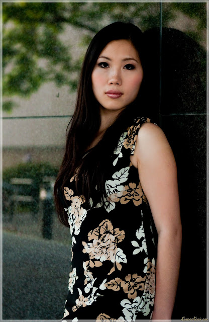
Every shooting session needs a darker, more serious shot. Here are two of my favorites using one of the dark buildings on Caltech. One is a soft dark shot, and the other one is a harsh cold-looking shot.


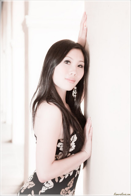
For some reason, many Asians like white-washed (hi-key like) shots. So here is one for the sake of variety:

Personally, I like vintage stuff. Below is an attempt at creating a 1960s film look. This could have been someone's mom in the 60s, or something:


In the end we had about 110 frames. 20 were duds (test exposures). I ended up picking only 30. All of these pictures were shot under an hour and a half, with five assistants. In the absence of assistants, I'd have to use umbrellas (instead of hand-hold diffusers), and it would have taken at least 4 hours. Thanks to Pam, Ben, Karla, Yuen, and Rob. That was pretty fun!

P.S. Feel free to send me more clients!

--------------
Technical data:
Nikkor 105mm f/2.8G VR
Nikkor 24-70mm f/2.8G
Lensbaby Composer f/4

2009-08-07

How blurry is your Hollywood Style Creamcheese Bokeh?

Lens sharpness is of high importance for most photographers. When a picture is sharp, they see more details. When they see more details, the viewers' neurons fire as if they're saying "Oh this really captures the moment, I love this picture." There are lots of published reports on lens sharpness. Manufacturers and independent testing corporations have their own MTF results that describe a lens' characteristics in terms of contrast and resolution. The more contrast and resolution a lens can reproduce, the "sharper" an image will project to the film or sensor. Every lens has a best and worst sharpness depending on the location (center or corner) of the projection, and it is very dependent on its aperture. In general, almost all lenses have the best "sharpness" in the center at the sweet spot of the middle f-stop (for full frame, that is about f/5.6-f/8).

While there are numerous published MTF, there is not a standard when measuring the quality of blur (aka "bokeh") in a lens. This is mostly because the quality of a blur is very subjective. Below are two pictures using two different lenses (courtesy of http://www.rickdenney.com):


Don't look at the wine-- both are equally sharp. Look at the background blur. A majority of the people on internet forums will say that the background blur for the top picture is very busy and distracting, while the background blur for the bottom picture is more uniform, more creamy and soft. The top one has a lot of bokeh balls that look like donut rings, whereasa the one on the bottom has more creamy, soft, smushed artistic look. Ken Rockwell has a pretty good graphical explanation here. Of course, there will always be a minority that prefers a busy looking bokeh (with donut ring shapes, weird shapes, inconsistent inner fill, etc).

While lenses optimized for sharpness are great for action/sports, landscape, and architectural work, lenses that yield soft creamy bokeh are great for portraits and for artistic purposes. So while it's interesting that while many people spend lots of money buying the sharpest lenses, there are a few who will spend even more buying the lens with the softest bokeh money can buy. Below are two artistic bokeh examples I found that I like:

Courtesy of Rogvon. This using a 55mm Voitglander which yields an amazing creamy soft bokeh.


Courtesy of Dustin Diaz. This is using the famous Nikkor 200mm f/2 which yields a huge bokeh. Note that many new Nikkor G lenses tend to exhibit a ring around the bokeh ball. This is a very typical 200mm f/2 bokeh.

According to Google Trends search, more and more people are looking at lenses not just based on the criteria of sharpness (which is of high importance for most work out there), but also bokeh characteristics. Lately, I've been hearing the term "Hollywood Style Creamcheese Bokeh". It really means the same thing as just "bokeh", it's just that the word Hollywood emphases the blurring and transition techniques commonly used in Hollywood movies.


What lenses do portrait photographers use? They use the lens with the most pleasant looking bokeh so that they can obliterate the background into soft and creamy cheese to make their subjects pop out. The best bokeh lenses are ones that are f/2.8 or below (which happens to be the minimum aperture for pro-line lenses), usually 85mm and above. The biggest bokeh shape is achieved by 1) grabbing the longest lens you can get your hands on 2) opening up the aperture from f/1.4 to f/2.8 3) setting the lens focus distance to MINIMUM while moving your body to aim at the subject 4) making sure the background light source yields a nice blur 5) use LIVE-VIEW on the camera because bokeh cannot be seen on the viewfinder. Note that even if you try all of the above, you will not always get a consistent result. The reason is bokeh is not only sensitive to focusing distance and settings, but also dependent on background light intensity! This is why the lens that yields a nice bokeh one day may not yield the same the next day-- a lens will have a tendency to yield bokeh one way or another, but that tendency is not guaranteed 100%.

Below I have put up a result of different bokeh characteristics of the different lenses I used. The background green and blue bokeh balls are my router and cable modem lights. By taking the bokeh of a light source at night time, I am isolating the shape, transition, and fill of individual bokeh looks for more objective viewing. I need to do this at night because during day time, all the light balls will be smushed together, and the background blur will usually look pleasing regarding of the lens used. Note that I don't own all of the lenses below. Thanks to everyone who lent me their babies.

Click here to see it in details:


Personally, my favorite is the Nikkor 24-70mm f/2.8 used at 70mm. It is a very versatile zoom with the quality of a prime lens, and the bokeh shape is mostly consistent and the fill is solid. There is a slightly line/edge on the rounded bokeh balls, but that is acceptable IMHO. There are not many lenses with great bokeh AND sharpness-- this is one of them.

My second favorite is the Nikkor 105mm f/2.8. It has a very low minimum distance, thus small objects can have huge looking bokeh. It can also obliterate the background into art. The contender 70-200mm f/2.8 is an excellent bokeh lens, but I didn't have one to play with at the time.

The Lensbaby Composer (the 3G is a typo) is a very good bokeh lens when used at f/2.8 and beyond.

The softest, creamiest bokeh is the Sigma 50mm f/1.4 at f/1.4. The edges are super soft, it's like an angel painted the balls! However, f/1.4 on this lens aperture yields very soft images.

A peculiar bokeh here is the old 1980 Nikkor 50mm f/1.8 AI-S. It has 7 blades, and you can see the heptagonal bokeh at a higher aperture. This can be useful for certain types of shot (product with shapes). I wouldn't use it for people or pets though, but you'll see this peculiar bokeh characteristic frequently in older pictures, especially from the 60s to 80s-- the era Nikon ruled the SLR 35mm world.

Lastly, it's important to note that none of these examples have ugly donut shape bokeh like ones from the 18-200mm f/3.5-5.6G VR (I had it for 2 months and sold it off). This is a hideous lens that yields ugly busy background blur. There are numerous other really bad bokeh lenses, mostly those with higher than f/2.8 aperture (e.g. 3.5-5.6, 4-5.6, etc etc). I didn't have the pleasure of testing+trashing them here, but if you Google for their names and the word "bokeh", you can see how bad they are.

2009-08-05

Strobist: producing Googly colored shadows


I stumbled across an article where I couldn't figure out how lighting was done in such a way that there were 3 different colored shadows casted on subject (see http://www.style.com/vogue/feature/2009/07/machine-dreams/ for the full article on Marissa Mayer below):


Then Thomas Kang told me "I believe it's subtracting colors, not adding them. You set up multiple color lights that add up to white, then when something gets in the way, it occludes only some of the lights but not the others, resulting in "shadow" areas where only those non-occluded lights shine, which no longer cancel out entirely, so they produce colors" Well duh! I knew that! :) I was curious to see how easy it was to duplicate the result, and took out my 3 flash and gelled them with different colors: yellow, blue, and red. Here are the results:

First, I make sure that ambient light isn't contributing to exposure (indoors, 200 ISO, f/4, 1/200 second):

Then, I set up the 3 strobes (yellow and blue on opposite sides). I took six different exposures taken at different times. By the way Buster is a very good super bear model and sits still very well.

Top left: yellow only. Top middle: red only. Top right: blue only.
Bottom left: no yellow. Bottom middle: no red. Bottom right: no blue

As you can see, bottom middle or blue+yellow make almost perfectly balanced colors (complementary). Adding a tint of red, and then manually doing white balance later yields the final result below with all 3 flash on:

That was pretty fun! By the way if you look at Marissa's picture, you'll see that there's at least yet another light (white) on the left side in order to make a harsh shadow to the right. Also the order of the color is different than the one I used. Now go out, gel your flash units and have fun!