2009-12-24

Humor: pet photography

From http://graphjam.com/2009/12/22/funny-graphs-pet-photography/

2009-11-11

Color IQ: Color test your eyes

A lot of people ask me how to do color balancing. How much of it is subjective/objective? What's the best approach? Is there a system to it, or is it all about art?

This is a complex subject that I have an easy, fast, and systematic way of dealing with it. A professional photographer doesn't need to have a perfect sense of what white color should be. He/she simply needs to balance the color such that there is a good separation of non-white colors and white colors. In today's world, color balancing is done in several ways. One camp of school is to do it in-camera and shoot JPG and set the WB setting perfectly the first time. This leaves no room for error because a wrong color balance setting on the camera can mean un-recoverable color tones. The other camp of school is to shoot in RAW and post-process the RAW. Post processing is easy. If a picture has bits of perfect white/gray color, he/she can tell the program what that white/gray tone is, and thus set the entire picture into perfect tones. However, not all white and gray-looking surfaces are of balanced colors. Most likely, all surfaces have a hint of blue/yellow, or variation with hue in them. In addition, certain lighting conditions simply do not produce a balanced lighting (CFL, sodium light), in which case it's best to turn the photograph into black and white.

In many cases, one needs to use his/her eyes to make the final judgement. This requires 1) having good sets of eyes and 2) color balanced monitors (most Macs are pretty good). Without good eyes, a perfect monitor is useless. Likewise, the reverse is true.

To date, I only found one good site that tests your eye's ability to distinguish color. It is XRite http://www.xrite.com/custom_page.aspx?PageID=77

Give it a try! It's pretty fun. This is what you see when you start:

This is what you want to end up with when you're done:

You get a score at the end.
Have fun!

Now about the subjective part. One can always tone a picture to look a certain way. After color balancing, it is easy to add a bit more yellow (to look more vintage, to give more warmth at night, etc), or a little bit of blue (to give a little bit of that cold look). What I do personally is to always color balance first, THEN tone the picture. Reverse the order and you'll get into a lot of weird results and inconsistency. In summary, do the followings in this order:

1) Get good monitors, and calibrate it using tools like Spyder 3, etc.
2) Verify that you have a decent sense of color by going to the XRite site
3) White balance your pictures
4) Tone if necessary

2009-10-11

Canon vs. Nikon Marketing Strategies

I meant to post this last year but somehow didn't get a chance to finish writing it, thus please back-date this blog to 2008.

Canon and Nikon have been fighting in the SLR and DSLR market for several decades. From the 60s to mid 80s, Nikon dominated the professional film SLR market share. When Canon came out with better technologies such as auto focus and other electronics automation after the mid 80s, many pros (especially those who shoot sports) switched to the Canon EF-mount system. For the next few decades, Canon SLR (and lately DSLR) dominated both the pro and consumer SLR market. Today the competition is just starting to heat up. Every few months, both companies come out with something better and/or lower priced than the other brand. Both companies get a bulk of their revenue *not* from their professional grade camera equipment, but with a flood of plastic, cheaply made consumer grade equipments (sub $500, sub $750, and sub $1000 SLR cameras and cheap kit lenses).

The consumer grade segment of the market is most vital to both companies because they account for a bulk of their revenue and thus is their bread and butter. One way to gauge the competition is to go to a store. I go to Costco frequently and chuckle whenever I see both Canon and Nikon DSLR boxes side by side. As of late 2008, the two consumer grade cameras that Costco sells are the Canon XSi and D60. While both try to compete for similar price range, looking at the boxes, one may feel that they're actually aiming for different types of consumers!

Below is a 2008 Canon XSi picture I took using a Canon SD740 point-and-shoot camera at Costco. The box shows a frozen action of a boy catching a football. Guys love sports. Guys love frozen action, and zoom. There's something about BIG ZOOM, having a big zoom is like having a nice sportscar with XXX horsepower and YYY torque. Guys want the biggest plasma/LCD TV. Fastest cars. Most megahertz computers. Things of that sort. This Canon Rebel is a guy's camera. Just look at the specs, it's sexy!


Below is the exact same item as above but has a different packaging, in 2009. Look at the fancy jargons like "Optical Image Stabilizer Double Zoom Lens Kit", and below, a bunch of fancy stuff like "12.2 MEGAPIXELS", "Digic III", "3 inch LCD", "3.5 Frames per second", "EOS", "Picture Style". Wow! If I were a guy who loves to look at specifications all day, I'd get a Canon Rebel because it's obviously better on a spec-by-spec comparisons.


Let's now look at the Nikon D60. You see a woman with a bunch of smaller images on the side (baby smiling, flower, kids, etc). There's no sports. There's no emphasis on frozen action. There is no fancy jargons to woe you. There IS however lots of emphasis on people... portraits... softness... prettiness... connection to people. No jargon, just "FAST, FUN, & EASY." Nikon's strategy is about connecting to people in the simplest possible way.


Let's look at another Nikon, the D5000 (2009). Unlike Canon that screams technical jargons and specifications, Nikon box simply says "Smart, Sharp, Simply Brilliant." Again the emphasis is on people. Happy people, with happy emotions.


Let's look at yet another Nikon, the D3000. Similarly, it's got happy people. Kids. The camera captured the moment. "Incredible pictures, incredibly easy."


So what's going on? Canon's strategy is to use what they're traditionally good at: sports and specs. Do you remember the late 1980s when Canon EOS Rebel flooded TV with their ads blitz? "It's so easy to use, amateurs can capture Andre Agassi like a pro!" Canon loves to show pictures of sports, frozen in time. In addition, Canon uses higher specifications (higher megapixel, more frames per second, higher processor name, etc) to lure certain types of buyers-- the Specification Peepers. Boys. Men. Guys. People who generally want the highest megapixels, biggest LCDs, most horsepower, most torque, biggest lens, biggest of everything. Canon is the ultimate boy's toy, because boys can brag to each other that they have a biggest spec'ed camera, the Canon. You know,"my cannon/piano/whatever is at least 3 inches longer and thicker than yours so I'm a more dominant male", that sort of thing. Spec for spec, Canon will have more features, for the same price or lower. Canon [on paper] is the most incredible machine on earth. Not surprisingly, Canon is an engineering company where engineers design and optimize the camera by spec, and they will out-spec any competitor, period.

What does that leave Nikon with? Nikon's strategy isn't to use specification to sell.
Nikon doesn't need to compete on specs, because not all specs are relevant to the discerned buyer. For example, higher megapixels doesn't mean better image quality (in fact, more megapixel means more noise at night). There are other things to consider, like contrast and color rendition that Nikon excels at. For example (on similar settings), Nikon tends have warmer and more accurate auto white balancing hence psychologically more eye pleasing portraitures (this is all according to DXO Mark). In addition, Nikon tends to have lower megapixels but better night time capability (higher ISO with lower noise), whereas Canon tends to have higher megapixels (great during day time) but less night time capability (higher ISO with higher noise). Of course, color/contrast/night pictures are difficult to sell so instead of trying to describe it as specs, Nikon marketing decides to simply put portraiture of people on their boxes hoping people could just see how great their cameras are. There are other intangible items that Nikon hopes discerned users can feel such as better built quality (vs. the cheaper plastic housing of Rebels); Nikon is traditionally known to be more rugged and this has been true since the 60s when more journalist used Nikons to take pictures of Korean and Vietnam war than any other brands, and that more Nikons went to space & NASA than any other brand. They are also known to have excellent usability, and usability consistency in their product lines (a consumer D40's UI isn't too different than that of the professional D700).

None of the differences should be a surprise. The two camera brands have had very different philosophies since the 50s and 60s. Canon embraces the latest and greatest technologies while mass producing them (at the cost of durability) whereas Nikon is conservative and will only embrace new technology when absolutely necessary. Also, they have had very different philosophies in what types of images their cameras should capture. In the old days for example, Canon traditionally values more resolution (at mid-aperture), whereas Nikon values more contrast at wide-open. Below is an illustration of a 1950's pictures (directly from
Dante Stella's article on resolution vs. contrast trade-offs in lens design, http://www.dantestella.com/technical/nikoleic.html):


On the left is Canon, which gives great resolution at mid-aperture. On the other hand, to the right is Nikon which gives great contrast wide-open. There is no "wrong" choice in trade-offs, just preferences. Photographers shooting sports or landscape is likely to opt for the company that values great resolution (higher MTF 30 lp/mm and higher megapixels on the Canon), and photographers shooting portraits and/or at night is likely to opt for the company that values contrast (higher MTF 10 lp/mm and better ISO on the Nikon).

Today, the differences in contrast and resolution between the two companies is no longer a big factors in choosing the "right brands". Both companies employ engineering techniques to yield some of the best products that we have seen to date, and both companies make lenses that yield very similar resolution and contrasts. Today, what makes them different is that Canon is consistently making higher megapixel cameras (21MP) that looks amazing during day time and decent at night, whereas Nikon is consistently making lower megapixel cameras (12.1MPP) that looks decent during day but superb at night. Like the old days, Canon still uses more plastic parts today to save costs and pass the savings to consumers (e.g. 5Dmk2, T1i) whereas Nikon has slightly better built quality to endure harsher conditions better (e.g. D700, D90) but cost more.

In short both companies embrace very different philosophies and employ different engineering techniques and both create great products. Sometimes there is no right camera to use for every single possible situation. For certain situations, Canon can be marginally better than Nikon, and vice versa. I for one prefer Canon and its superior pro-telephoto lens selections for events such as sports/bird shooting, but at other times I prefer Nikon for their Creative Lighting System for shooting portraitures, product shots, and night time.


-----------------------------------------
Links to other sites:
Trade-offs in lens engineering:
http://www.luminous-landscape.com/tutorials/understanding-series/understanding-mtf.shtml

Contrast vs. resolution philosophies of Leica, Contax, Canon, and Nikon:
http://www.photoethnography.com/ClassicCameras/index-frameset.html?focusing.html~mainFrame


2009-10-10

Janice and Jeff's Wedding

Pam and I had the pleasure of shooting at Janice and Jeff's wedding. It was a very lovely wedding and we had a blast both as guests as well as photographers. Speaking of photographers, I've never seen so many photographers AND videographers at a wedding in my entire life! I can only imagine that the coverage was superb. Anyways, without elaborating further, please enjoy these pictures that Pam and I took! By the way some of the pictures below are CLICKABLE as easter eggs to bigger resolution pictures. Have fun!


That's it for now.! If you need photographers or need recommendations on photographers (I know a lot of them) you can email me. My contact is posted on www.KameraKevin.com. -Kevin and Pam

2009-10-06

Catch light in models

I was curious one day and went to the women's hair coloring section in Walgreens and snapped a few pictures with my wife's Canon SD750 (it is such an amazing camera!):

No, I didn't walk in with an SLR. I find that the moment I put my eyes through a camera's view-finder, I get kicked out 90% of the time whenever I'm on a private property for one reason or another. SLRs are huge, cumbersome, and impractical to use most of the time.

I organized the snapshots below. Take a careful look at them. Photographically speaking, what do these pictures have in common? Which pictures do you like/dislike and/or catch your eyes? Try to answer these questions as you're looking through these pictures:


Photographically speaking, these pictures have the followings in common:

1) All of them used diffusers (bounce, softbox, octobox, or umbrella) to cast gentle lighting on the face, to either carve and accentuate some parts of the face, or to flatten the shape of some parts the face.

2) All the eyes are in sharp focus. They say the eye is the window to a person's soul, and when the eyes are in focus, the entire picture is in focus [psychologically speaking].

3) Almost all have at least 1 main catch light in the eyes, placed between 1 o'clock and 11 o'clock position-- aka your very standard text book studio shot. Wikipedia says "Catchlight is a photography term used to describe either the specular highlight in a subject's eye from a light source, or the light source itself. They are also referred to as eye lights or Obies, the latter a reference to Merle Oberon, who was frequently lit using this technique. A catch light may be an artifact of the lighting method, or have been purposely engineered to add a glint or "spark" to a subject's eye during photography. This technique is useful in both still and motion picture photography. Adding a catch light can help draw attention to the subject's eyes, which may otherwise get lost among other elements in the scene."

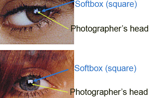
4) All the catch light are using interior artificial lighting, be it an umbrella, softbox, octobox, or some type of studio diffuser. Four models on the left column used a single softbox (square). A softbox looks like the following:
In fact, if you look at the eyes carefully where there is a white bright square in their eyes, you'll also see a little bit of a ball shaped thing below the white square. That is actually a photographer's head! This is pretty common in studio settings where you want the softbox slightly on top of the model, and the photographer needs to get in front of the softbox to make the shot.

The rest of the pictures use either octobox or umbrellas. An octobox looks like the followings:


Portable studio umbrellas look like the following (there's also a bounce panel to the right):


When a human being looks at a portrait, he/she has an intuition what looks good or not. But photographers can go one step further and decompose and analyze at how the portrait is shot. In the case of portraits, pictures that have catch light have a higher tendency to catches the viewers' attention.

There is one picture that does not place the main catch light between the 1 o'clock and 11 o'clock position. That's the bottom right model where the catch light is actually below and to the right of the model's pupil. This gives her a little bit of a mysterious look (along with a darker broad lighting position to cast more shadows on her left cheek, to make her look even more mysterious than the other models).

Going back to the model pictures, which models catch your eyes? What lighting techniques are used in those pictures that you like? Do you prefer a single source catch light, or multiple light source catch light? Do you prefer the look of a softbox (looks more like a window), or do you prefect the octobox/umbrella look?


* Men's hair dye products do not emphasize the eye as much. The catch light is typically smaller because the photographer usually moves the lighting a bit farther. Farther lighting source gives a bit more harsh feel to the face (opposite of diffusing light for women), which is appropriate if you want the man to look harsher and more manly. Go to any men's hair color section and you'll see what I mean-- smaller catch light, harsher lighting source that yields more square looking face.